Take a look around the web at reviews of Vision Pro and you’ll find that practically everyone agrees: Vision Pro’s display is excellent. Words like “crisp,” “smooth,” and “4K,” are commonly used when people are talking about the headset’s visuals. But what if I told you Apple’s headset actually has a lower effective resolution than Quest 3?
Editor’s Note: Words like ‘display’ and ‘resolution’ are often used as a catchall when talking about an XR headset’s visuals. In this article I’ll be using the term “resolving power” to describe the maximum possible detail that can be seen through a specific display pipeline (this encompasses both the display itself and the lens through which the display is seen).
I have to admit, from a purely perceptual standpoint, it very much feels like Vision Pro has the best looking display of any standalone XR headset to date.
And this makes sense, right? Vision Pro has an 11.7MP (3,660 × 3,200) per-eye resolution (we know this thanks to the hard work of iFixit) which means it has 2.6× the pixels of Quest 3’s 4.5MP (2,064 × 2,208) per-eye resolution.
That should mean Vision Pro has 2.6x the resolving power, right?
Despite that huge difference in raw pixels, there’s now compelling evidence that Quest 3 has greater resolving power than Vision Pro, thanks to the careful efforts of XR display expert Karl Guttag. That means the combination of Quest 3’s display and lens can resolve objectively more detail than Vision Pro can.
This can be seen in the through-the-lens photos below which show the same test image on both Vision Pro and Quest 3.

It’s clear when comparing the various font sizes that Quest 3 is showing somewhat sharper outlines. Even if the difference is ultimately small, this is quite incredible given how many fewer pixels it has than Vision Pro.
The lines under the labels ‘3 2 1’ are also a clear test of resolving power. As they get smaller, they require greater resolving power to appear as lines instead of just a white blob. As we can see under ‘1’ on Vision Pro, the lines are mostly indiscernible, whereas on Quest 3 you can still roughly see some aspects of the line shapes.
This is the result of each headset’s own resolving power bottleneck.
Because we can’t make out individual pixels seen through the lens, Vision Pro is clearly bottlenecked by its lenses. Sharper lenses would mean a sharper image.
On the other hand, Quest 3 is bottlenecked by its resolution. More pixels would mean a sharper image, because the lenses are sharp enough to resolve even more detail.
Why Are People Gawking Over Vision Pro?
I don’t know anyone that thinks Quest 3’s display looks bad by any means. You just don’t hear the same gushing over it compared to Vision Pro. So what gives? Is this just Apple fanboyism at work? I genuinely don’t think so.
Although it’s a major factor, there’s much more to what we consider a ‘good looking image’ than absolute resolving power alone.
From my experience with many hours in both headsets, the single biggest factor in why Vision Pro feels like it has the better display is simply what is shown on the display.
It doesn’t matter how much resolving power your lens and display has if the content you’re putting on the display has less information present than is possible to be resolved.
On Vision Pro, Apple does an exceptionally good job at matching almost every piece of the underlying interface to the headset’s resolving power.
Every panel, window, icon, and letter is rendered with vector graphics which have ‘unlimited’ sharpness, allowing them to render sharply no matter how close or far you are to them. This means these graphics are almost always taking full advantage of the number of pixels available to render them.
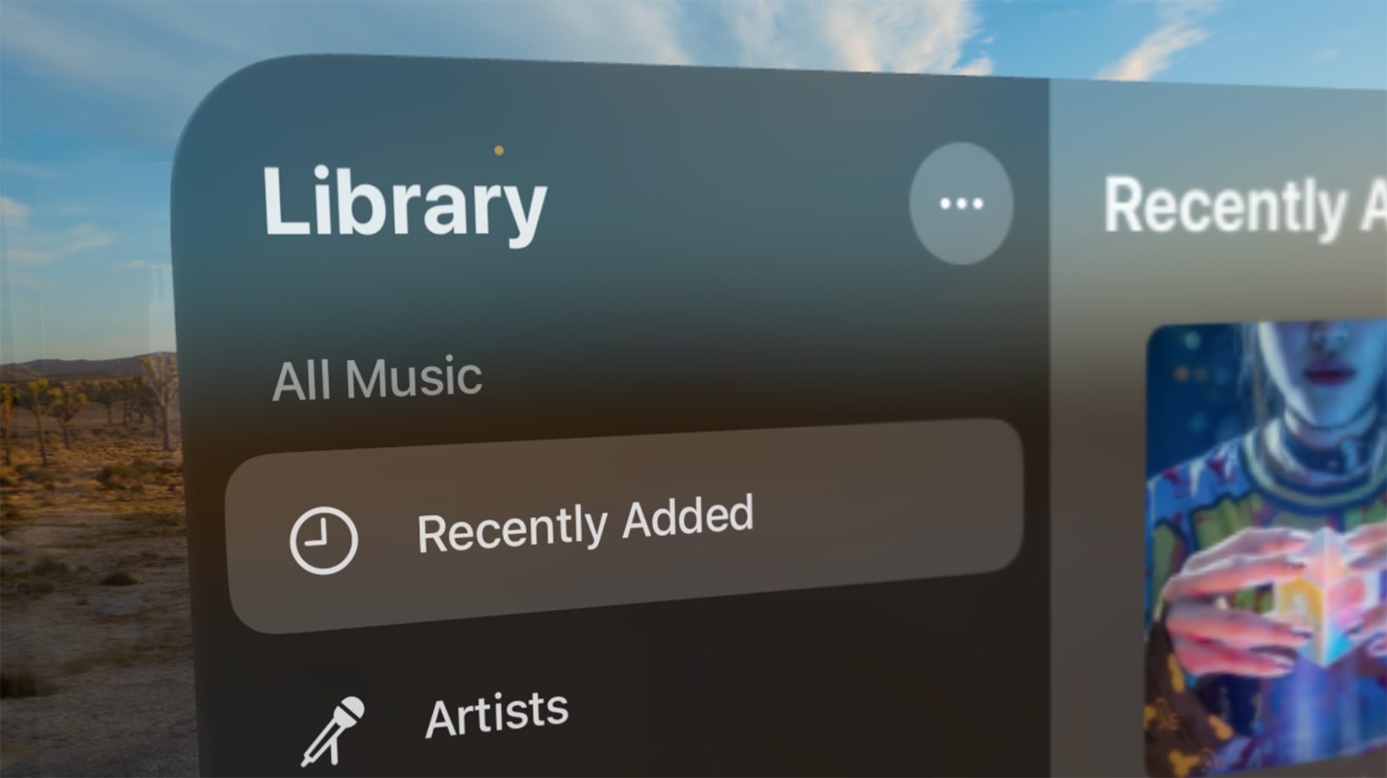
Additionally, default virtual environments are captured and rendered in very high fidelity, and do a consistently good job of matching the headset’s resolving power.

In the browser, most web elements like buttons and fonts are rendered faithfully as vector objects, keeping them sharp no matter the distance or zoom level.

Apple also takes care to avoid situations where users could make text or other elements too small (which would make them difficult to read without more resolving power).
There’s a limit to how small you can make a windows, and if you make a window small and then move away from it (to make it even smaller) as soon as you grab it again the window will automatically adjust to its optimal size. Grabbing a window and moving it away from you also automatically scales the window at the same time, ensuring that the window becomes larger exactly in proportion to how far away you move it. This means text and other elements in the window retain their optimal size visually, even if they are more distant.
Apple is able to achieve much of this extra fidelity no doubt thanks to the headset’s powerful M2 processor and the use of dynamic foveated rendering, which concentrates rendering detail only where the user is looking.
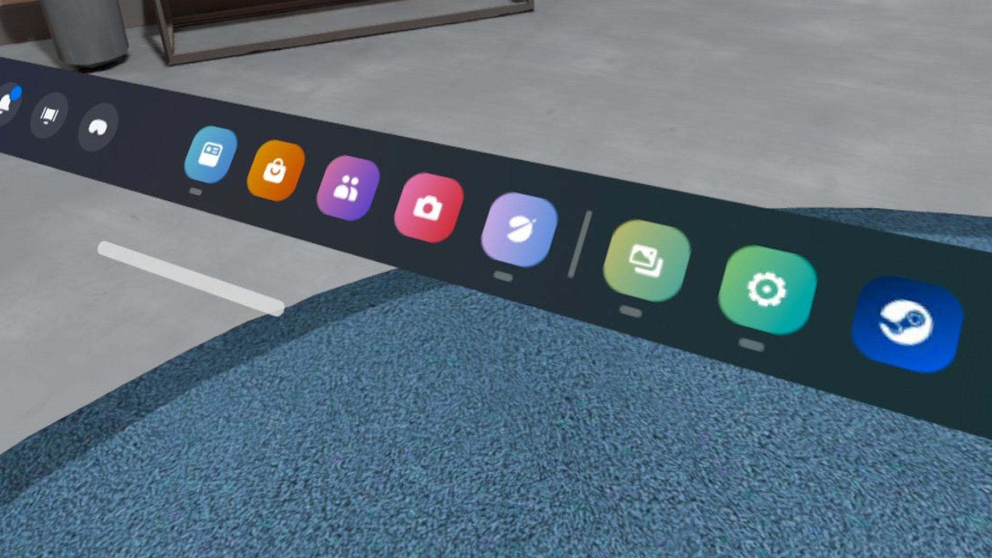
In the case of Quest 3, the interface is rendered largely with raster (rather than vector) graphics, including fonts. This means they only have optimal sharpness at one specific distance and angle. If you get too close to them you’ll see visible pixelation, and if you get too far they will be more prone to aliasing (which makes text look a bit like it’s jagged or flickering).
Default virtual environments on Quest 3 don’t come close to matching the headset’s resolving power. It’s easy to spot low resolution textures used throughout the environments (especially in the skyboxes that make up the distant background), often clashing with some textures and geometry in the same experience which actually are suitably sharp. Aliasing is also apparent throughout, making the edges of objects look jagged.

In the browser, web pages are rendered into a texture and then placed onto the virtual display, effectively converting all vector web graphics into raster graphics that don’t look as sharp or scale optimally at different distances and angles from the screen.

Ultimately all of these little details add up to making an image that doesn’t look as good as it could be, and failing to match Quest 3’s impressive resolving power.
More Than Sharpness
Sharpness of the content isn’t the only thing that makes people feel that one image ‘looks better’ than another. Factors like color saturation, contrast levels, brightness, and framerate, can have a major impact. Even high quality sound can make people feel that one image has higher quality than another.
With an OLED HDR display, Vision Pro is capable of showing richer colors with a higher peak brightness, which further makes the headset’s image feel ‘better’ than what’s seen through Quest 3, even if Vision Pro has slightly less resolving power. It’s also significantly easier to actually find high quality video content that’s optimized for the headset thanks to native streaming apps like Apple TV, Disney+, and HBO Max.
For instance, I recently used Vision Pro to watch Mad Max: Fury Road on a plane, in 3D, with surround sound and HDR. Quest 3 simply doesn’t have the same easy access to high quality video content.
And though Quest 3 actually maxes out at a higher refresh rate (120Hz) than Vision Pro (100Hz), very few applications ever run at this refresh rate on the headset. Few Quest 3 apps even reach Quest 3’s 90Hz mode (while Vision Pro apps generally run at 90Hz).
It’s also common to see frame stutters on Quest 3 (which makes motion inside the headset look like it skips a beat). On the other hand, Vision Pro has an incredibly steady refresh rate which rarely has any stutters (if any).
What it All Means
Ok so why does any of this matter? Well, it’s just one more example of how on-paper specs don’t always tell the full story. Human perception is way too complex to boil down the perceptual quality of a display simply to the number of pixels it has.
Additionally, Quest 3 has a ton of overhead with all of its resolving power. Meta’s next headset could have the same exact display and lens combo, but with more power (and more careful optimizations), it could provide a significantly sharper image on average.


