As I mentioned last time, the Steampipe dashboard for Mastodon has evolved in unexpected ways. I imagined that the components — a plugin that maps Mastodon APIs to Postgres foreign tables, and a suite of views that query the APIs — would combine to enable a broad overview of activity in the fediverse. That didn’t pan out for two reasons.
First, I learned that the Mastodon community didn’t appreciate the kind of surveillance required for such analysis. That was the original community, I should stress, and things have changed dramatically, but I want to respect the original ethos. Plenty of people will, nevertheless, crawl and index the fediverse, but I don’t need to put my shoulder to that wheel. And if I did I’d be pushing Steampipe out of its sweet spot: realtime acquisition, querying, and visualization of API-sourced data.
Second, Mastodon’s API allows 300 requests every five minutes. You can use Steampipe in batch mode to defeat that limit, and you can store data permanently in its Postgres database, but that cuts across the grain with respect to both Steampipe and Mastodon. All Mastodon clients are subject to the same API rate limit. If you use the web app, or one of the phone apps, you will likely never have seen a message announcing that you’ve hit the limit and need to wait a few minutes. I never saw that message until I started querying the API with Steampipe while also using the web app.
So if Mastodon culture and tech resist deep data mining, and the system is optimized for clients that live within an API budget of 300 requests every five minutes, what kind of Mastodon client could Steampipe enable? It wouldn’t be a conventional client because Steampipe is a read-only system. The path forward would be some kind of reader, or browser, that augments the interactive apps.
The outcome, so far, is a suite of dashboards that display tabular views (along with some charts) of the home, local, and federated timelines, of my toot history and my favorites, of my follows and followers, of my notifications, of searches for terms, people, and hashtags, and of the timelines formed by the lists to which I’ve assigned people I follow. These are all HTML tables rendered by Steampipe’s dashboard server. The columns are all sortable, and the cells of the tables can contain only links or plain text.
Given that the toot content returned from the Mastodon API is HTML, the plain-text-only constraint felt, initially, like a blocker. No images? No links in toot content? What good is that?
Some constraints are worth embracing, though, and that may prove true here. The views created this way put a lot of information onto the screen. Here’s my default view in the stock client.
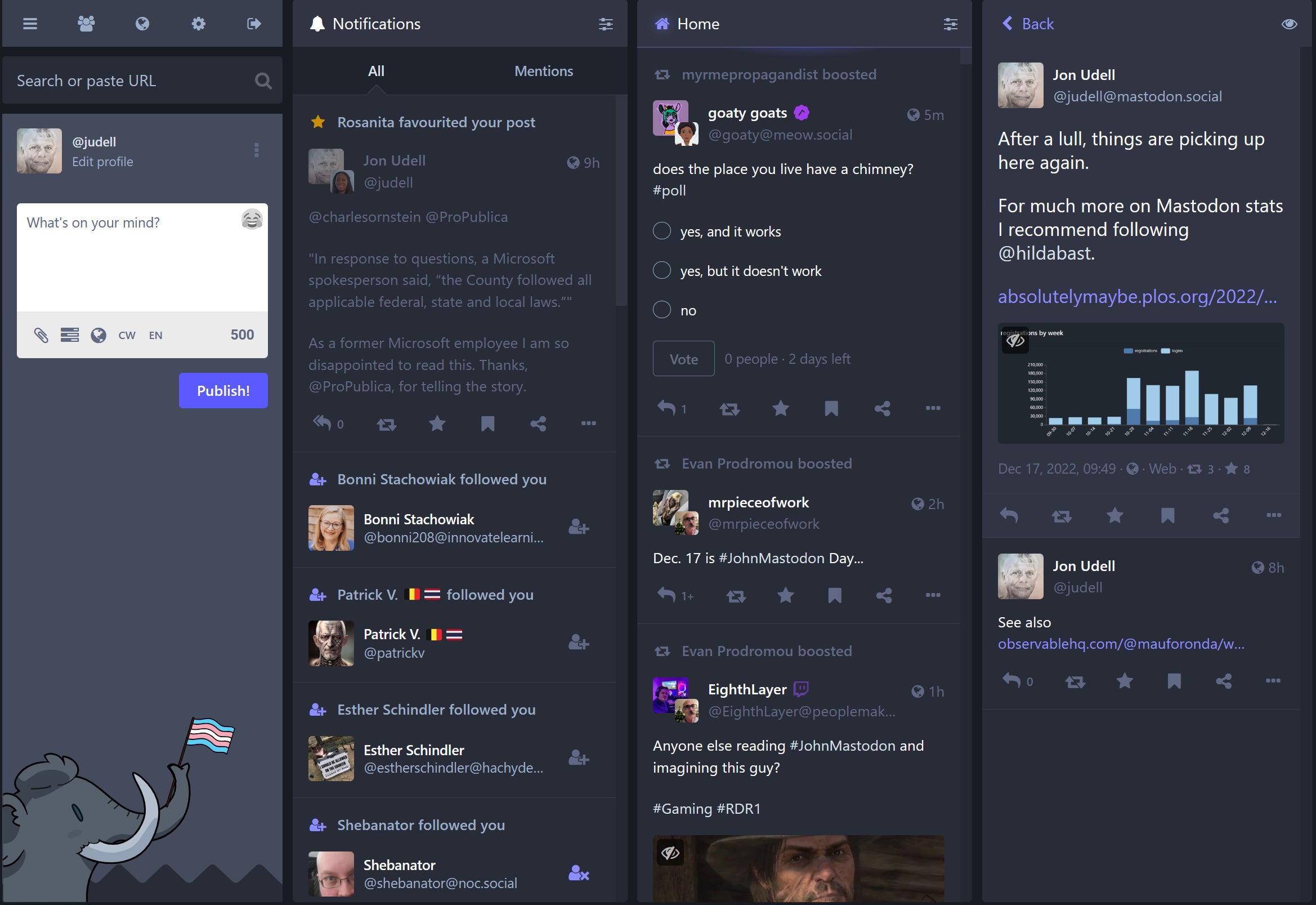 IDG
IDGAt a glance I can see three items on the home timeline, and if I want to scroll through 100 items I can only do so awkwardly in small gulps.
Here’s my home timeline in the Steampipe dashboard. I can see a dozen items at a glance, and can easily scan 100 items in gulps of that size.
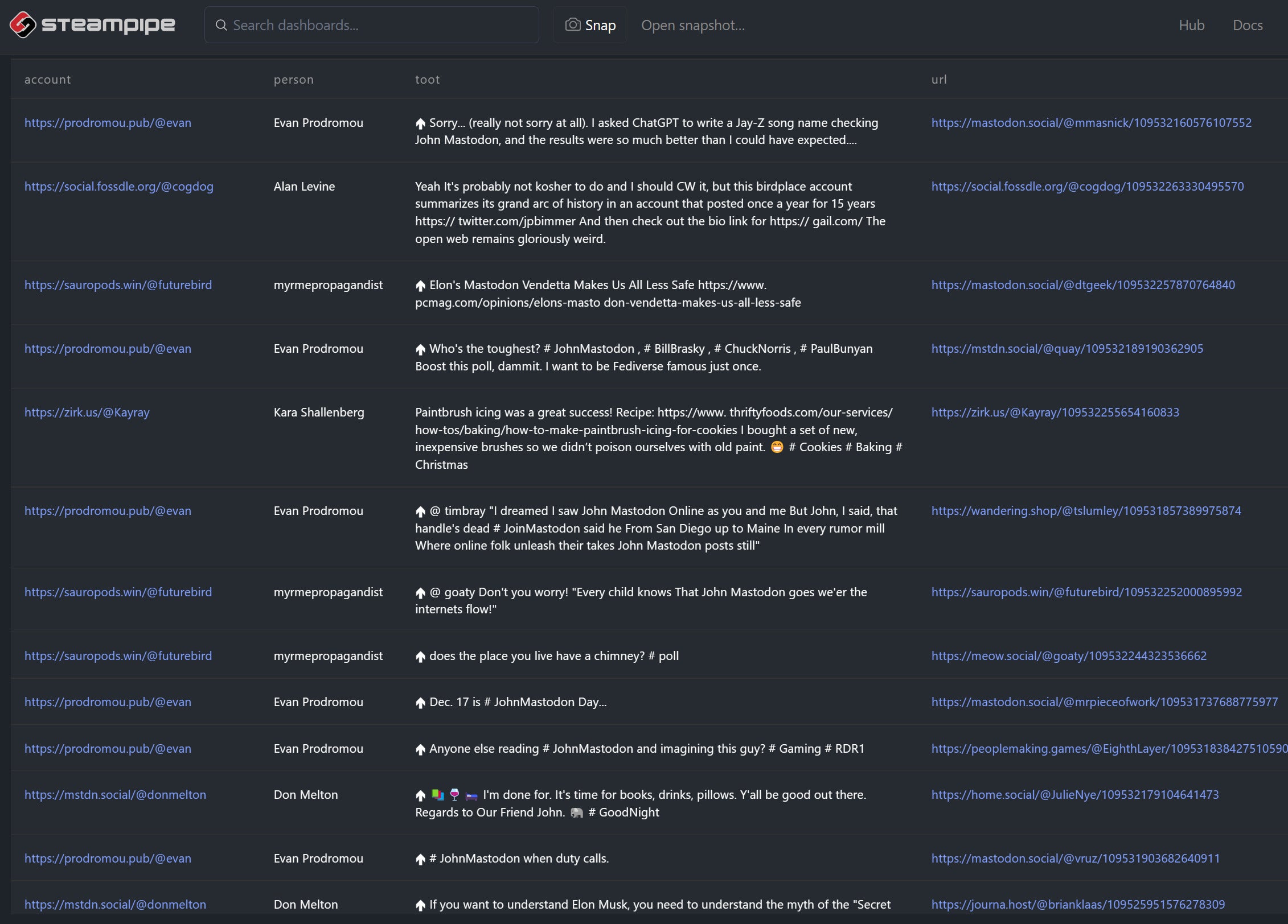 IDG
IDGWhen I described this effect to Greg Wilson he gave me the title for this post: “That sounds like the Bloomberg terminal for Mastodon.” I’ve never used one, and I’m aware that its design is often derided as a UX disaster, but as I understand it the product is built to enable traders to scan fast-moving data feeds from many different sources. In that sense I do think it’s an interesting and useful comparison.
The underlying principle is one I’ve learned from Edward Tufte: present information at maximum density. Our brains are built to take in a lot of information at a glance, and if it’s organized well we can do that very effectively. It feels like that’s happening for me when I scan these densely-packed views of Mastodon activity.
To enhance the effect, I’ve begun to apply filters. In a Mastodon timeline, for example, a chatty person can dominate what you see at a glance. When we participate in social media we are always making bids for one another’s attention. As publishers of feeds it’s wise to consider how a flurry of items can overwhelm a reader’s experience. But it’s also useful to consider ways that feed readers can filter a chatty source. Steampipe’s SQL foundation affords an easy and natural way to do that. Here’s part of the query that drives the list view.
select distinct on (list, user_name, person, hour) -- only one per list/user/hour
  person,
  url,
  hour,
  toot
from
  data
order by
  hour desc, list, person
It was easy to implement a rule that limits each person to at most one toot per hour. Next steps here will be to apply this rule to other views, show the number of collapsed toots, and enable such rules on a per-person basis.
There are always links into the Mastodon web app, and I follow them when I want to view images, boost someone, or reply to someone. The dashboards help me scan a lot of Mastodon activity quickly, and decide which items I want to interact with. Your 500-character toot is all you’ve got to grab my attention, and I’ll only see it as an unformatted chunk of plain text. That’s a pretty severe constraint, and not everyone will want to embrace it, but it’s working pretty well for me so far.
I expect that our dashboard system will support formatted text and images in cells of HTML tables. When it does I’d like to make it an option you can turn on or off in Mastodon dashboards. What should the default be? I suspect I’ll want plain text and no images, especially if image captions can appear along with the text of toots. Some of the original Mastodon cultural norms aren’t surviving the onslaught of new people, but writing descriptions of images is one that’s held up so far, and it’s a wonderful thing. So write a short thoughtful post, write a caption for your image if you include one, and if you capture my attention I’ll click through to view and interact.
Copyright © 2023 IDG Communications, Inc.


